
‘Stunning!’ Apollo Moon Photos Too Good to be True?

Jason Farago, who appears to be a Deep State propagandist and pro-UkroNazi culture warrior, just published a New York Times interactive photo-video piece headlined “How Lunar Photography Brought the Heavens Down to Earth.” Farago celebrates the alleged artistic genius of the Apollo moon photos, viewing them as the climax of the overlapping artistic and scientific histories of moon explorations and representations.
Moon landing skeptic and professional photographer Massimo Mazzucco says that’s bullshit. Farago’s extravagant praise of the Apollo astronauts’ brilliant use of deep depth of field just means they knew how to crank the f-stop up to f16 or f32 (which I figured out about five seconds after buying the cheapest available Pentax when I was a journalism student back in 1976). His orgasmic effusions about the beautifully-rendered lunar surface texture sound like something an LSD tripper might say while staring hypnotically at the ground in some godforsaken stretch of barren desert. And his ranting about how many of the moon landing photos are so perfectly composed and executed that they look totally fake really takes the cake:
“The photographs were in fact so good—and the 70mm stock so detailed—that doubts set in on the blue sphere below. With their rich chiaroscuro and starless skies, Bean and Conrad’s photos looked uncannily like a Hollywood stage set.”
Uncannily indeed. Is Farago engaging in classic neocon doublespeak (surface layer for the ignorant rubes, esoteric layer for the cognoscenti)? Is he nudging and winking at the cognoscenti in a shared moment of dupers’ delight? Was this assignment handed out by the Deep State desk at the New York Times to blow smoke to cover for delays in the Artemis missions? Or is Mazzucco wrong in his claims that many moon landing photos are obviously fake, and that the most likely explanation of these and other anomalies is that the Apollo missions didn’t really put men on the moon circa 1969-1972?
Watch Mazzucco deconstruct bad New York Times propaganda, watch his film American Moon, and make up your own mind.
Excerpts from the Interview
Welcome to a special edition of False Flag Weekly News, the weekly news show that normally peels back the news headlines to reveal what’s crawling around underneath. Today we are going to be interrogating the perhaps most influential newspaper in the Western world, The New York Times, by way of a special art and science uh photo analysis that they did discussing the moon landing photos from the Apollo missions. And who better to talk back to the media on that subject than Massimo Mazzucco? He is the director of September 11th: The New Pearl Harbor, possibly the best and most comprehensive 9/11 documentary film, as well as American Moon, probably the best film about the moon landing. So, hey, congratulations on making the best conspiracy films in two genres.
Thank you. It’s not for me to say they’re the best. I can certainly say they’re the longest. Because September 11th: The New Pearl Harbor is five hours and the American Moon is three and a half.
Well, that’s what I meant by comprehensive. I was trying to be nice. (laughter)
Okay. Okay. Let me just clarify very quickly. There’s a reason for that. I don’t like to entertain people more than is needed, except that for both films, I use the technique where I first present the problems or the issues (with the official stories). Then I present the explanations or answers that the debunkers have for each of those issues. And then I present the debunking of the debunkers. So each argument, each issue, is presented from three times: The presentation (of holes in the official stories), what the debunkers say about it, and what I have to say about what they say.
There’s a term that David Ray Griffin coined first. It’s called debunking the debunkers. And that’s why I like to have it all in one film, all comprehensive, both questions and answers. And then people can make up their own mind, of course.
Yeah, it’s a great format. And honestly, I think they’re the best as well as the most comprehensive films, partly because of that format. And we’re going to follow that type of format here too, because we’re going to see what the New York Times says about these images. And then you get to say what you have to say about them. And unfortunately, we don’t have the New York Times here to answer you, so we’ll just have to leave it at that.
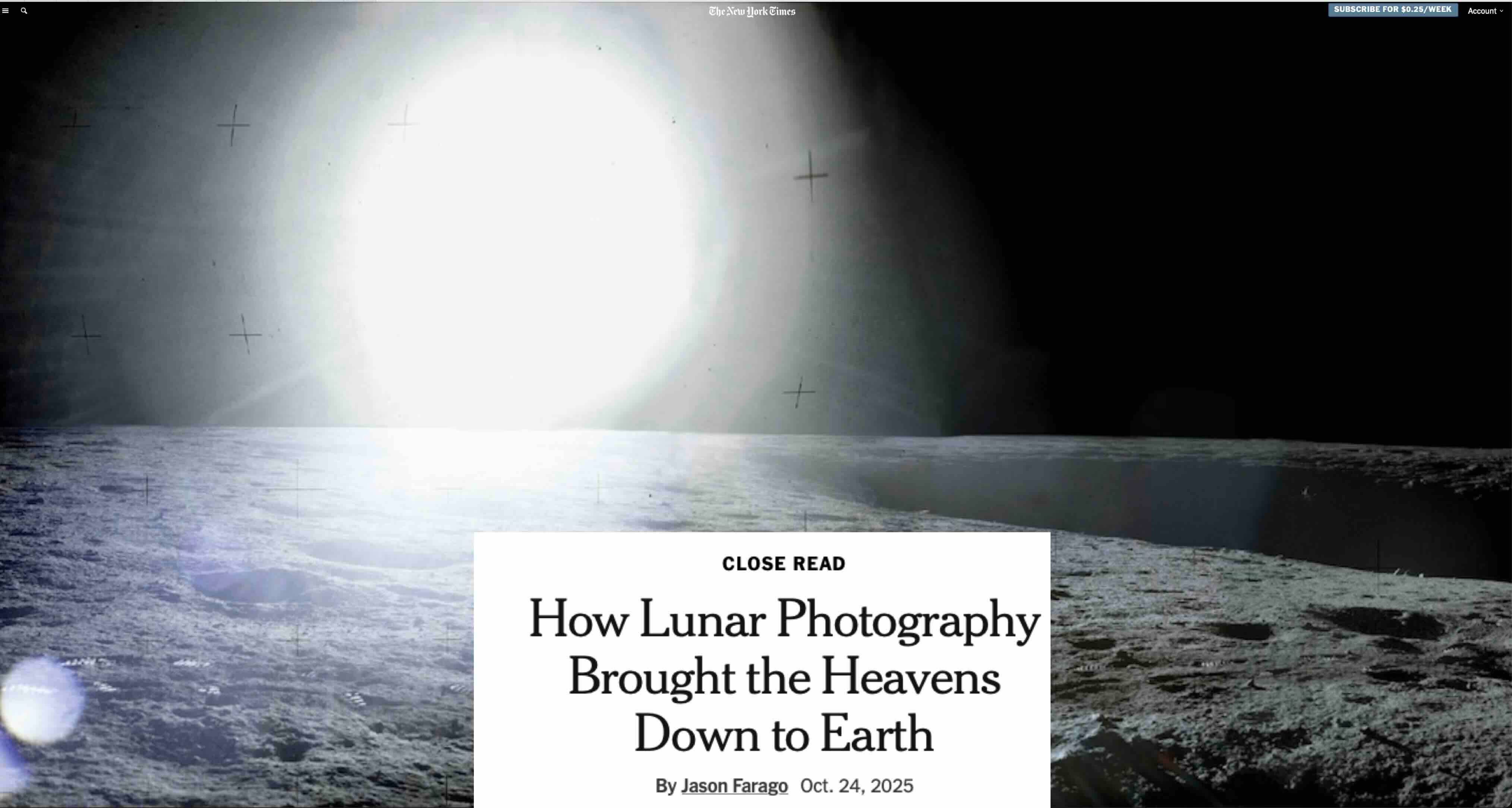
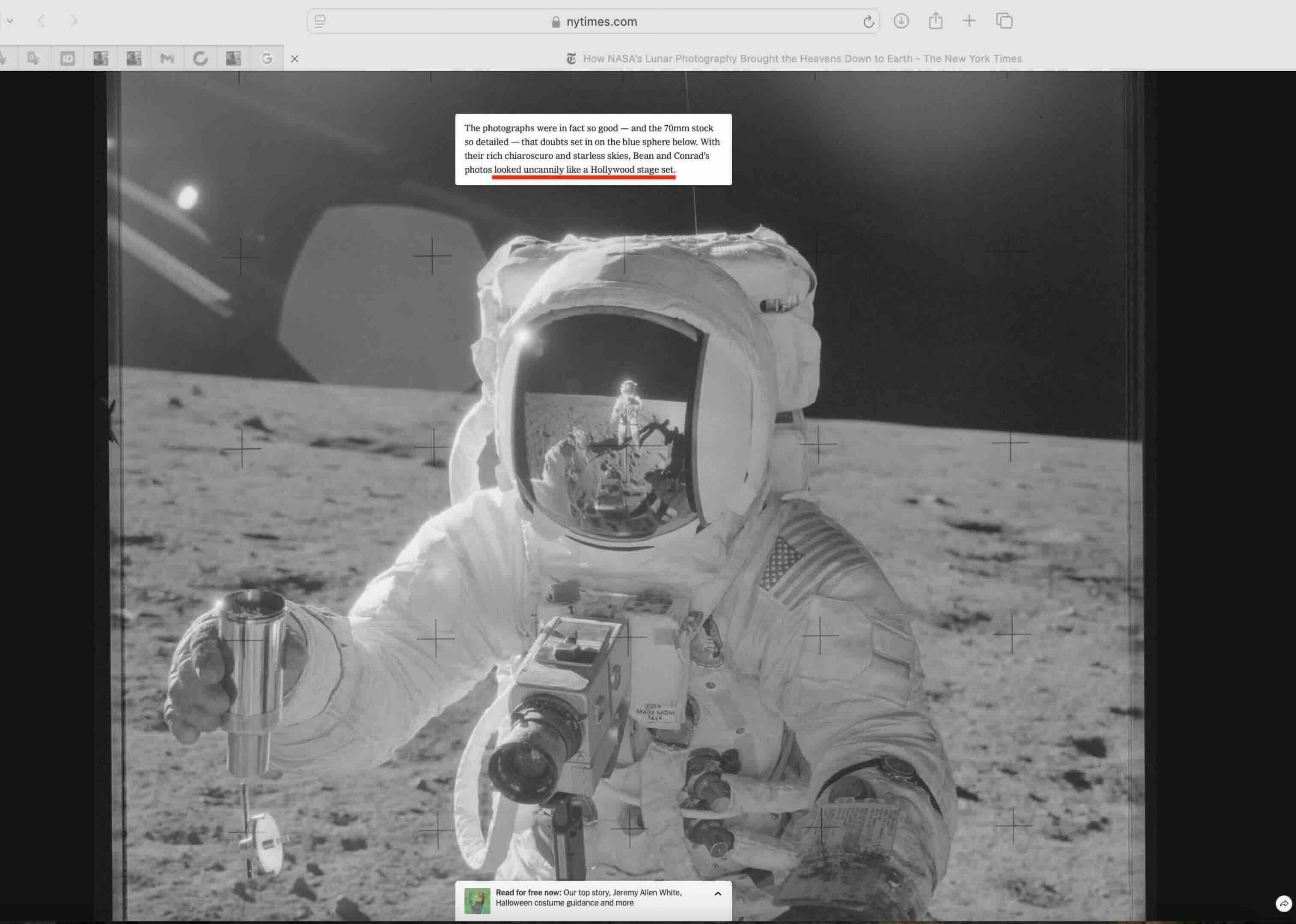
Let’s look at our slideshow. We’re going to do a close read on this New York Times photo exhibit. Here’s their opening shot. They’re really ecstatic about the artistic quality of the moon landing photos. And in a couple of places, they actually mention that it looks almost suspicious. These photos are almost too good to be true. What do you think, Max?
I don’t think they’re good at all. No, I have to tell you…maybe your audience doesn’t know. I have been a photographer for the first part of my life, let’s say between age 20 and 40.. And I was a professional, at the top level. I was working for magazines all over the world. I was using actually the same cameras and film and lighting that supposedly were used in the Apollo missions.
I’ll give you one quick anecdote so you understand the point of view of a professional. I learned my trade from a famous photographer, now deceased. He just passed away a few months ago. His name was Oliviero Toscani. He’s actually the guy who made the Benton campaign all over the world. He was very, very famous. I would put him in the top 10 in the world history of fashion photography. I was his assistant for about three years. Then we parted ways. I went on to have my own career.
Back in 2000, when I saw the lunar pictures for the first time—all of them, not just the few that were published before, but all of them that were put out by NASA on the internet—I looked at them and I could see all the defects that I would find myself when I tried to replicate sunlight in the studio. So I got very suspicious. I called Toscani and I said, “Oliviero, what did you think the first time you saw the Apollo moon pictures?” And his answer was, and I quote him:
“I always thought that had they given me the job, I would have done a much better job.”
Wow, better than Neil Armstrong! Because you’re going to see how the New York Times praises Neil Armstrong (as a photographer)…Okay, so they begin with this poetic passage: “The darkness we expected. What we had underestimated was the silence, the quiet of the vacuum, disturbed only by our breath and the radio in our ears.” So that’s supposedly these Air Force guys, these astronauts. You think that they hired a literary guy…
There’s a problem. These astronauts were wearing what is called the PLSS, the Portable Life Support System, which provides them with both a cooling system for the body—because you have over 100 degree Celsius temperature on the surface of the moon—and air for breathing.
So in the back of the PLSS, you have these pumps that are supposed to be both circulating water and pushing air through the system so that you can actually breathe. Except when you listen to their conversations, there’s absolutely no noise. There’s no noise whatsoever.
No wonder they underestimated the silence.
Yeah, exactly. Because you’re in a studio when nobody is making a sound. That’s why you hear all the silence. If you had those machines really on, you would hear probably a purring in the back of your ear. You would hear of these pumps working. Nothing of that is ever heard in their conversations.
In the opening picture, that light tells me that is a studio spotlight facing straight into the camera. It is not the sunlight. The sunlight acts differently. With the kind of lenses that they had, the kind of distortion that you would have inside the lens is much different than that. That, to me, tells me that that is a spotlight facing straight into the camera and making it look like the sun.
Another thing that you can tell is what is called the fall-off. You have a major amount of light coming through the center of the picture, straight in line with the sun. But off to the sides, if you look at the edge of the crater on the middle of the right of the picture, you can see that the more you go away to the right, the darker the ground gets. If this was the sun, you would have illumination that is equal all over the sand. In this case, you can tell that it is degrading towards darkness as you move to the right, and that is because that is the spotlight. It’s not the actual sun.
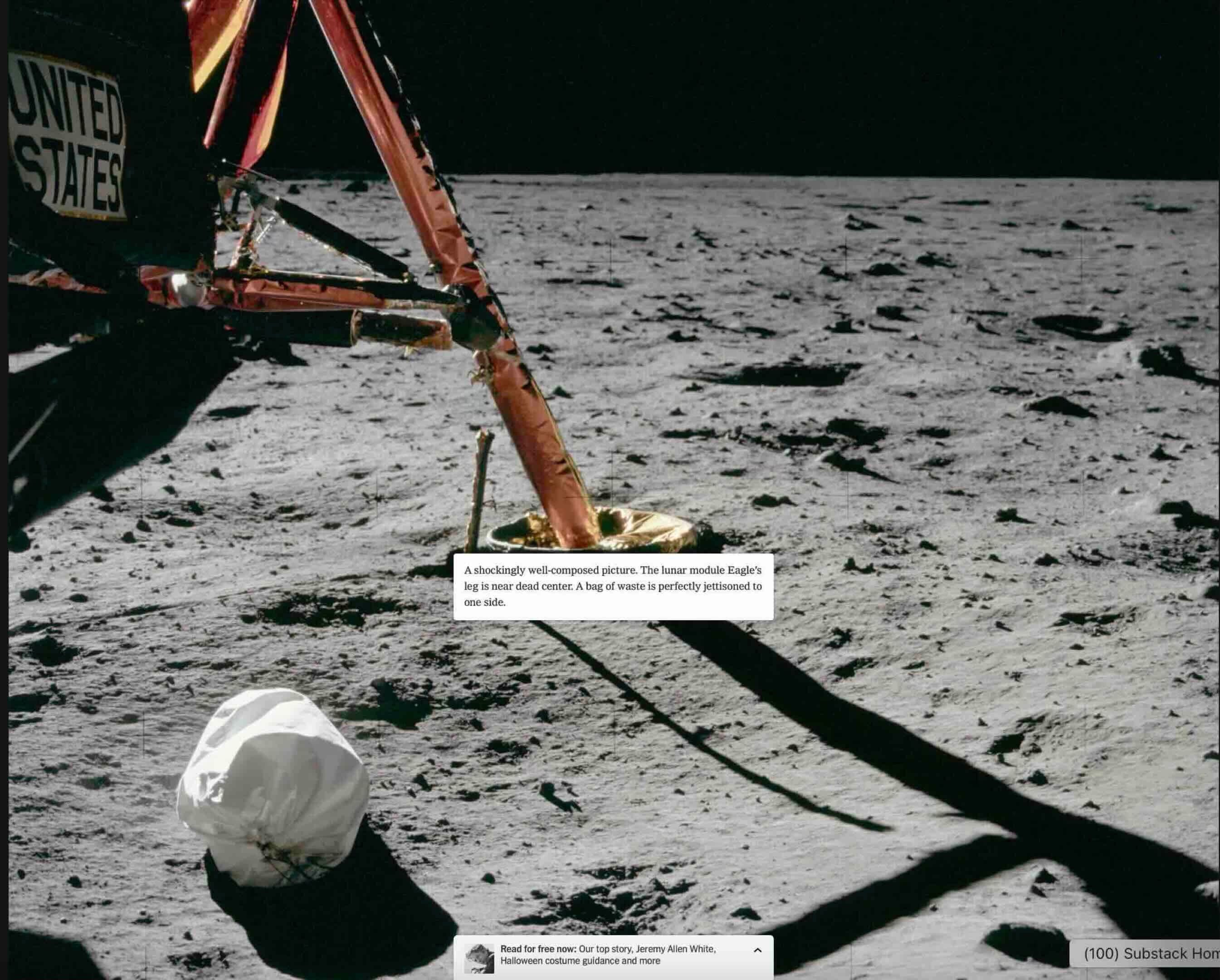
So here’s one where they say it’s a shockingly well-composed picture.
Yeah. I think they’re trying to influence the viewer by using all these words, shocking and beauty and all that. There’s absolutely nothing shocking in this picture.
“The lunar module’s eagle’s leg is near dead center. A bag of waste is perfectly jettisoned to one side.” So maybe they’re telling us it’s all a bag of waste. I don’t know.
How do you imperfectly jettison?
Ye ah I’ve jettisoned a lot of waste in my life but I can’t tell the perfect from the imperfect myself. But the New York Times, they’re critics. They know this stuff.
Yeah.
Do you see anything suspicious about this image?
I do but it would be a little too long to explain. Again there’s a fall off. But it’s very mild because they lowered the contrast. So I can tell that there is more light right below the LEM in the center left of the picture, it is brighter than on the far right. But it’s a very, very mild difference because the contrast is very low.So you can’t really tell here. Only a professional can tell.
The New York Times tells us: “During their camera training it became evident that Armstrong had a better eye than Buzz Aldrin…” Which meant he was the one taking most of the pictures for Apollo 11 in 1969…took more than 100 photographs. And the New York Times guy says: “I would happily claim, in fact, that Armstrong authored one of the last century’s signal works of American portraiture, his head-on view of Aldrin, legs contrapposto like a Greek statue in the southwest of the Sea of Tranquility.” Wow.
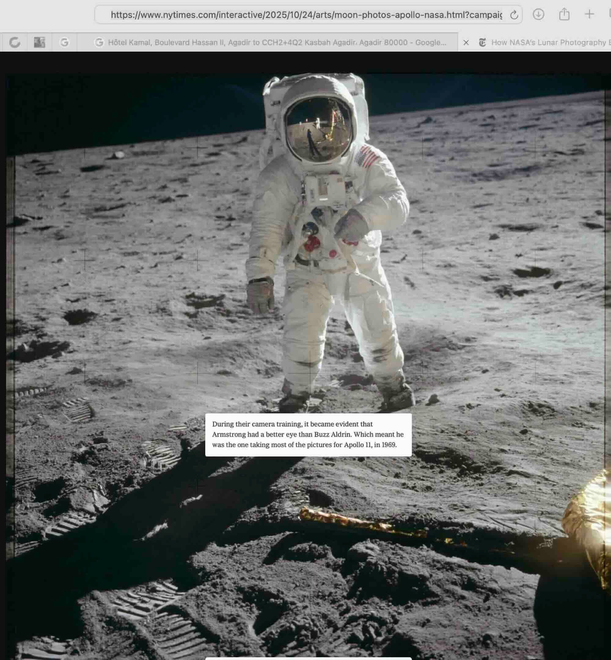
I would suggest we look at something else in this picture rather than read the caption. And the fact is that Aldrin, the person allegedly pictured in the photograph, is inside a little crater which is based maybe 10 centimeters lower than the average surface. And if you look at the way the photo is taken we can see the top of the helmet. Now remember the camera is allegedly sitting on Armstrong’s chest. So it should be at the same height, basically, as where the hand of Aldrin is, just a little higher. It would be impossible if I shot from my chest, even though the guy is in a little bit of a vacuum. It’s a small, it’s a little lower than the surface, but only like 10 centimeters. I cannot see the top of his head. So this picture is taken from a much higher viewing point than the actual chest of the photographer.
Could he have been on a little hill or something?
He could have except there was none. It’s all flat. They’re all basically on the same surface. If you look at other pictures of the situation it’s really all pretty much flat. And it’s one curious thing. You cannot prove that the pictures are fake. But again I can see now that the New York Times has used…a corrected set of pictures not the original ones. In the original ones, the original scans that were made from the original negatives, the contrast is much higher, and you can tell very, very easily that the guy allegedly being Aldrin is sitting in a spotlight. All around him, if you turn back the contrast to the way it was originally, before it was manipulated, you could tell that Aldrin is inside of a circle of more light, and that’s where the spotlight hits, as opposed to the background. The background, as soon as you lower…the contrast gets much darker than the ground he is standing on. And that should not be happening, if the source light were the sun.
I can’t believe the New York Times would be manipulating these pictures.
They’re not manipulating them themselves. They’re using a set of manipulated pictures that have been circulated by NASA, which are not original, but of course where the problems are less evident.
And here it says that’s our photographer reflected in Aldrin’s gold visor and one of the only still images of Armstrong on the moon. And so they zoom in and show the photographer reflected in the visor.
Yes. Well I mean that could be anybody of course. One wonders why would Armstrong, the first man on the moon, not have any pictures of himself? I mean you organize such a precise, such an accurate trip to the moon, where every detail is scheduled and laid down. They have papers with: “1005 turn around. 10010 breathe again.” I mean, everything is scheduled. And then they forget to take pictures of the first man on the moon. And we only have pictures of Aldrin. Could it possibly be that Armstrong, who did not want to be manipulated more than necessary, did deny them the right to say that that was him? Just remember, of the first man of the moon we have no pictures except one shot where you can actually see his face a little bit through the visor. And all the others it’s Aldrin. It’s very strange…they forget that you should schedule an actual photo up for the first man on the moon.It’s shocking. It goes together with the fact that they lost the original tape of the first moonwalk.
And of course their claim is that Armstrong was such a good photographer that he got to take all the pictures.
It doesn’t take a good photographer to take those pictures. They have the camera strapped on the chest.All they have to do is set the F-stop to focus the diaphragm, the lens opening the iris. And press click. They’re not even aiming, because they have the camera strapped to the chest. So all these shots that are well composed are actually a stroke of luck. Because you cannot see inside. You don’t have a viewer. You don’t have the viewfinder in that situation. So they’re really aiming by moving their shoulders. And guess what? All the pictures are so perfectly centered. Which is a little suspicious.
And here we see that Alan Bean and Pete Conrad of Apollo 12 are apparently even better photographers from the chest than Neil Armstrong is. These are even more “extraordinary.” And there were a total of 583 photos allegedly taken by Alan Bean and Pete Conrad of Apollo 12.
There’s absolutely nothing (extraordinary). What’s so incredible about this, is it is a set. All you need to do is sit there, focus and click. I mean there’s no artistry. The very idea that you’re looking for artistry…
Well, the horizon is horizontal.
The horizon is horizontal. And there are no hills in the distance, by the way. If you take what’s called the 360 panoramic of the whole, you turn around, you just stand there and turn around, click click click. And then they join them all together and you have a 360.
This landscape is like 200 yards not even in every direction. There’s no hills anywhere in the distance. Only after Apollo 15 did they realize that their sets were so skimpy that they had to add mountains in the distance. Apollos 11, 12 and 14 had a very very short horizon like this. I mean very short. And if you think that that object on the left was put there by a man, it means that the distance from here to there is maybe 20 yards. So you have another 20 yards and then what’s the end of the moon? There’s nothing else.
Yeah, that’s a pretty flat moon.
Look! The shadow of the LEM reaches almost the end of the moon. There’s no distance. I mean, think! You’re in a desert. You have to picture yourself in a desert with a LEM and imagine there’s nothing behind that little hill. There’s nothing. You can see nothing. It’s a joke. This is clearly a set. And besides, because of the use of the wide angle, this actually looks larger than it was in reality. In reality this set is no more than 10 meters by 10 meters, 30 feet by 30 maybe. That’s about it.
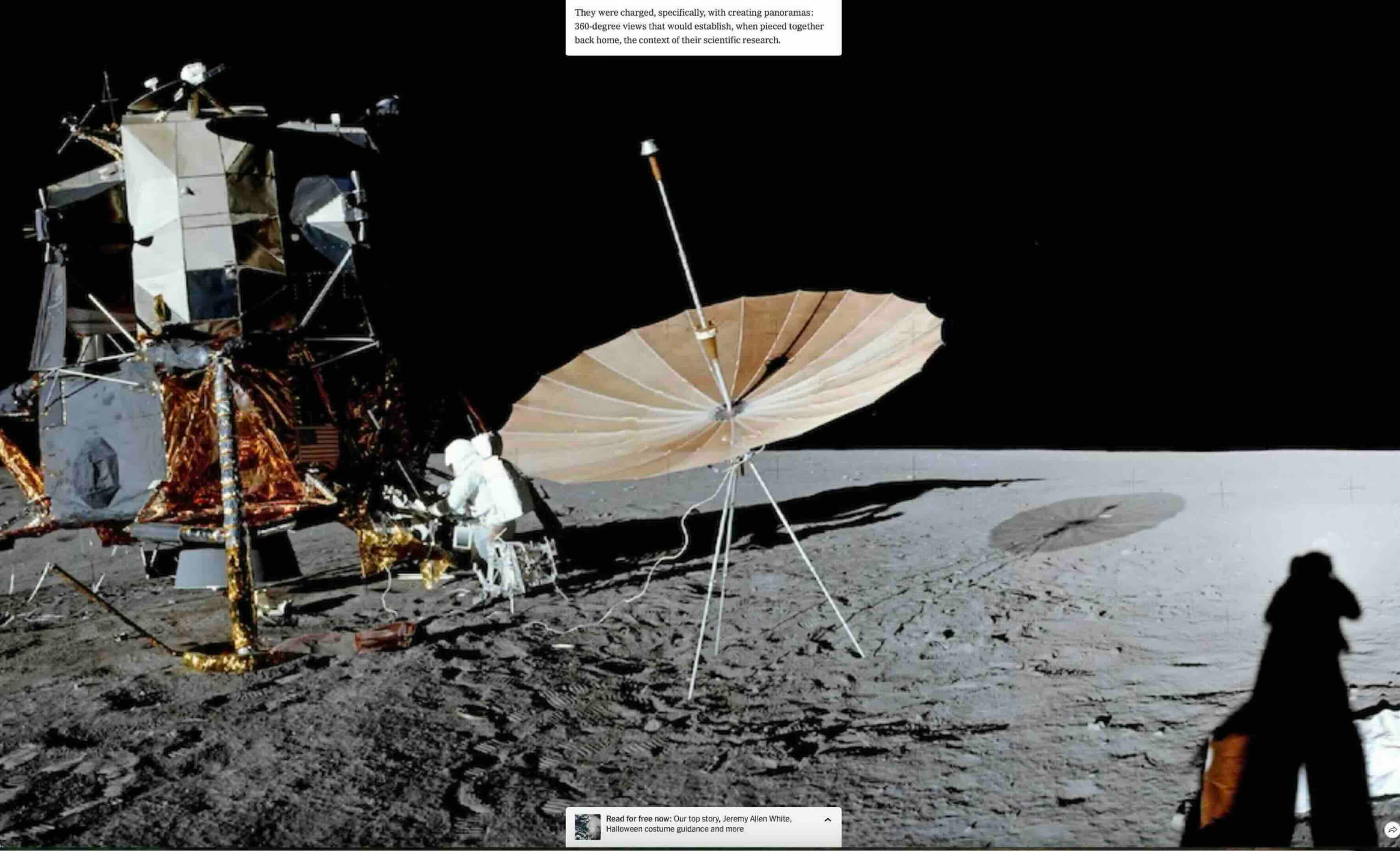
We’re told that they were “tasked with creating panoramas, 360-degree views that would establish when pieced together back home the context of their scientific research.” Then in the New York Times presentation it shows you the 360-degree panorama. Here’s the theme of the whole piece: “In one-sixth gravity, art and science did not seem so far apart.” They’re trying to tell us that the amazing artistry of these photos is some hybrid of art and science.
I really fail to see any artistry at all in these pictures. I’m sorry. I mean I know enough about good photography. Not only have I been a professional photographer for 25 years but I have enjoyed photography. I loved it. I know the great photographers, from Ansel Adams to Karsh. There’s a lot of history of photography that I can recognize. And I tell you what is an artistic picture. I see absolutely nothing artistic about these at all.
You’re not going to add Neil Armstrong to the list of great photographers…
Okay, here again the astronaut reflected in the visor, the little guy in the middle of the picture: On his right, our left, the terrain is much darker than on his left, our right. The sun is on the side. It should be equally illuminating both sides of his background. It is not. That means that is a spotlight that centers on him and it’s illuminating more the right-hand side from the way we see it than the left. That’s called an oopsie.
Interestingly, they chose this picture to tell us that it’s so good that it looks like a Hollywood stage set. This reminds me of Douglas Rushkoff’s Coercion, which describes mind control techniques that are common to operators from CIA interrogators to used car salesmen. And he describes how the key to mind control is to basically break down the subject’s sense of reality. And the way they do that is: the used car salesman takes you for a test drive. And at just the right point in the test drive he kind of turns to you while you’re driving the car and he says: “Is this the kind of car that you can see yourself driving?”And you try to see yourself driving the car that you actually are driving, and you have a sort of a brain fart. You have this space-out moment and lose contact with reality. And the car salesman then just takes over your world and orders you to drive back to the dealership. And he doesn’t ask you, do you want coffee? He just forces you to drink coffee, brings out the contract, and you walk out with the new car. And the CIA does a similar thing when they interrogate you. And so anyway, in this example, they’re inoculating you against the idea that this is a stage set by telling us it looks so good that it almost looks like it could be a stage set.
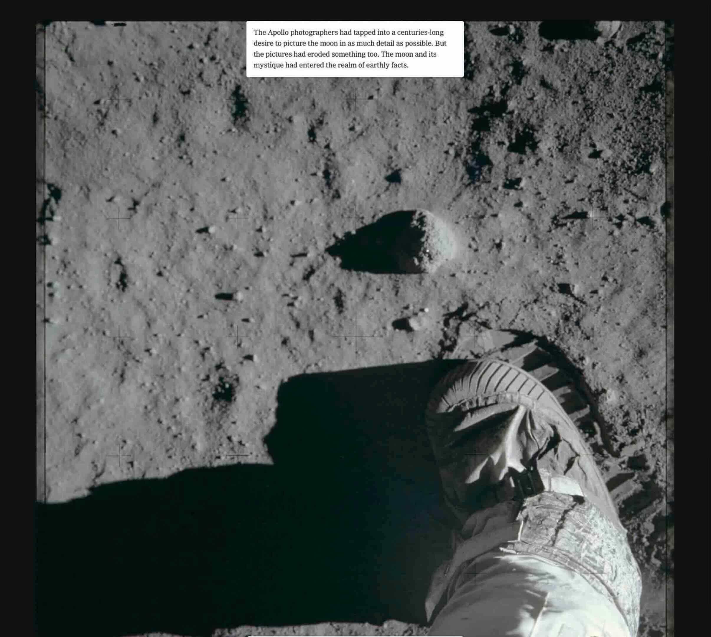
This is not the best picture of a footprint. But you can tell even from this picture—look how sharp and how…how sturdy, how solid are the little (rectangles of “moon sand”) that look like chocolate bars imprinted in the sand. Remember, there’s no atmosphere. Therefore there’s no humidity. Therefore that sand should be falling apart as soon as you remove your foot. How can you make it stick in such precise shapes without the humidity on earth?
Maybe they brought a little aerosol spray can and some gluey substance.
Exactly. You need humidity to get sand to stick like that. And there’s no humidity on the moon.
https://www.unz.com/kbarrett/stunning-apollo-moon-photos-too-good-to-be-true