
The Inevitable Drift Down from ‘Can’t Lose’ Owning Stocks to ‘Can’t Win’

Only those who experienced the heady euphoria of the late 1990s dot-com bubble in tech stocks know what the shift from “can’t lose” confidence to “can’t win” surrender feels like. The chart below illustrates this emotional cycle of confidence rising and fading as bubbles inflate and deflate.
Though we like to tell ourselves we’re rational investors, animal spirits are the driving force in euphoric bubbles where our beliefs direct our decisions: we come to believe that we’re smarter than the cautious dummies, that the technological revolution underway has plenty more room to run, that policies supportive of stocks have been refined and institutionalized to the point they’re rock-solid foundations, and so on.
Though the chart doesn’t go back to the 1870s bust or the 1930s Great Depression, the cycle played out in those eras, too. The process of confidence fading is painfully long, as the rewards of “buying the dip” have been so generous and reliable that we naturally assume any decline will be brief.
When the recovery we anticipated rolls over and reaches new lows, we’re sure the authorities will “do whatever it takes” to reinflate the markets, but authorities don’t actually have god-like powers; their powers only appeared god-like because conditions favored their interventions.
Every new low hurts, but we’re still confident that the market fundamentals are intact, authorities have plenty of policy bazookas they can launch, and the recommendations of Wall Street analysts to “buy the dip” are encouraging.
(Those trading in the 2000-2002 era recall Wall Street analysts touting dot-com stocks that had fallen from $80 to $40 as “strong buys,” meanwhile the stock finally bottom at $4. Following the “buy” recommendation yielded a 90% loss.)
We attribute any run of bad luck to over-confidence rather than misjudgment of the entire market and economy: OK, we blew the last few trades, but we can get our mojo back.
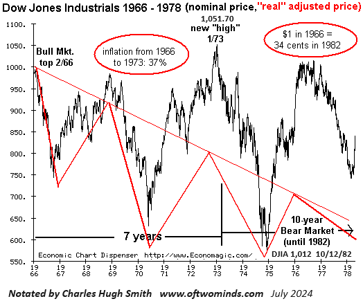
In the years this process takes to exhaust itself, inflation is eating away at nominal stock prices. As the third chart illustrates, when the Dow Jones Industrial Average (DJIA) finally returned to its 1966 peak above 1,000 in 1973, that didn’t mean investors were made whole; inflation had consumed 37% of the value of their stock holdings. To be made whole, DJIA would have to reach 1,370, not 1,000.
The real losses were even bleaker the next time the DJIA again closed above 1,000 on October 12,1982. Investors who held their index portfolios from the peak in 1966 to 1982 lost two-thirds of the purchasing power of their investment. They would not be made whole until the DJIA rose well above 3,000.
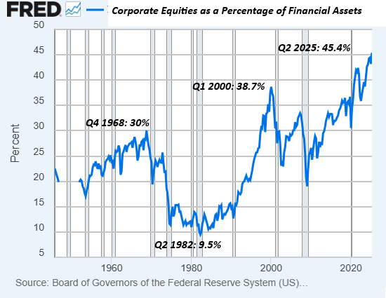
The trend that pops out of this long-term chart is that each new peak of household assets invested in stocks is higher than the previous peak. What will the nominal valuation of stock indices be when the percentage of household assets invested in stocks falls from 45% to 15%? What will the purchasing power of the money invested be (i.e. adjusted for real-world inflation) at that point?
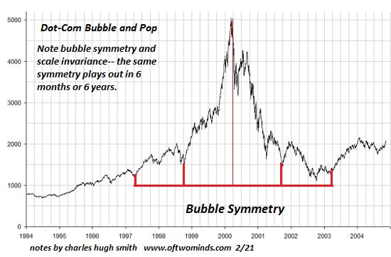
This is unknowable, but if history is any guide–and we have no other–then a 50% to 80% decline would be “normal.” Consider this chart of the dot-com bubble and deflation: an 80% decline, exhibiting remarkable symmetry:
Inflation renders nominal stock index valuations meaningless:
The drift from “can’t lose” to “can’t win” is slow and painful. Our beliefs are stubborn, and we cling on to what worked in the past long after it stopped working. Even if an AI program advises selling everything and walking away from the market for five years, how many of us would take this advice? History says: very few.
https://charleshughsmith.substack.com/p/the-inevitable-drift-down-from-cant